MetroWest Real Estate: What the Charts Reveal About Each Town Right Now
If you want the real story of the MetroWest market, ignore the noise and follow the data. These three charts — price per square foot, market time, and Heat Index — show the COVID jump, the cooldown, and how Dover, Medfield, Natick, Needham, Sherborn, Wellesley, and Westwood are behaving today.
Let’s call it what it was: COVID didn’t “influence” housing. It rewired it. The MetroWest market surged, then cooled — but it did not rewind. Values stayed elevated, buyer behavior normalized, and the gap between pricing expectations and market reality became the defining battleground.
If you’re buying or selling in 2026, the question isn’t “is the market hot or cold?” That’s lazy. The real question is: which town is hot, which town is cooling, and what does that mean for your strategy? That’s what these charts answer.
- The COVID spike is visible across every town in the price-per-square-foot chart.
- The cooldown is visible in market time and Heat Index — and it’s not uniform.
- Some towns are still “tight.” Others are signaling patience and buyer leverage.
- As a seller’s agent, my job is to position your home for your town’s current reality, not last year’s expectations.
- As a buyer’s agent, my job is to help you win intelligently — without overpaying or chasing listings emotionally.
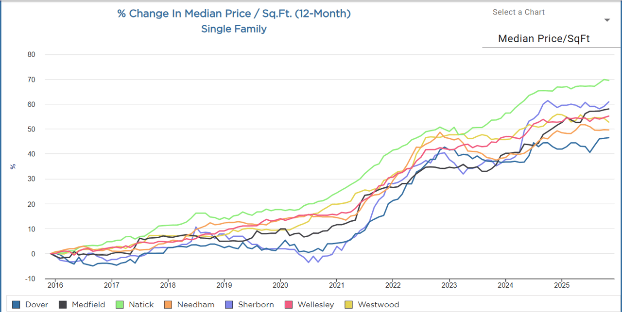
Chart One: Price Per Square Foot — The COVID Jump and the New Baseline
Start here, because this chart is the foundation. Price per square foot is one of the cleanest “apples-to-apples” ways to see how value moved across towns over time. It strips out some of the noise of different home sizes and different price points and highlights the trend: where value has climbed, where it leveled, and how strong the underlying demand is.
Notice what the chart does not show: a full give-back. The surge created a new baseline. That’s why “waiting for prices to come back down” hasn’t played out the way some buyers expected. The more realistic story is that the market cooled through behavior — fewer bidding wars, longer decision cycles, more negotiation — while values stayed historically elevated.
What separates towns now is the shape of the finish: who ends highest, who ends lowest, and who held onto momentum. That’s why you’ll see Natick finishing higher, Sherborn finishing premium, and Dover ending lower relative to the group — despite a strong long-run climb.
Chart Two: Market Time — Where Buyers Are Taking Their Time
Market time is the fastest way to see buyer psychology in motion. In a frenzy, homes fly. In a balanced market, homes still sell — but the path to “yes” takes longer. When market time rises, it usually means buyers are more selective, more price-sensitive, or both.
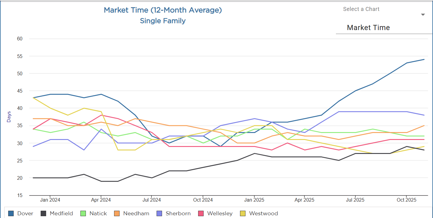
This is where Dover jumps off the page. If one town is broadcasting “buyers are taking their time,” it’s Dover. Meanwhile Medfield remains the tightest in this set — which matters if you’re pricing a home or writing an offer.
Translation: market time is your leverage indicator. Rising market time means buyers can negotiate harder and sellers need stronger positioning. Lower market time means you still have to move decisively — and sellers can command cleaner terms when the listing is right.
Chart Three: Heat Index — Cooling, Not Crashing
The Heat Index is a great “overall pressure” chart. It captures the competitive feel of the market across time. Heat rose sharply during COVID and then cooled. The key is how far each town cooled, and whether that cooldown stabilized or continued.
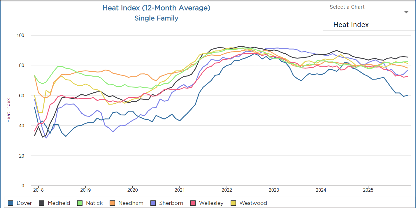
This chart is where Medfield’s resilience shows up and Dover’s cooldown becomes obvious. It also supports the “quietly strong” read on Westwood — stable heat, steady competitiveness, and efficient velocity without the chaos.
Town-by-Town: Full Read on Dover, Medfield, Natick, Needham, Sherborn, Wellesley, and Westwood
Below is the town-by-town breakdown using all three charts together. Think of it as a three-lens view: Price/SqFt is long-run value momentum, Market Time is buyer behavior, and Heat Index is competitive pressure. The goal isn’t to label towns “good” or “bad.” The goal is to understand what the market is rewarding right now — and what it’s punishing.
Dover
Price/SqFt growth: Strong long-run climb, but currently the lowest of the group at the far right of the chart. That’s not a knock on Dover — it’s the market sorting itself after a surge.
Market Time: The standout. Rising sharply into the mid-fifties days by late 2025, clearly the longest. This is the chart where Dover separates from the pack.
Heat Index: The most notable cool-down — trending down into the low sixties by late 2025. Competitive pressure eased more here than in the other towns shown.
Read: Dover has cooled more than the others; it’s the clearest “buyers are taking their time” signal. Buyers are still in the game — they’re just slower, more comparative, and less tolerant of aspirational pricing.
What this means for a seller’s agent strategy: Dover demands precision. The margin for “we’ll test the market” has shrunk. If the home needs work, the pricing has to acknowledge it — because buyers have time to compare against cleaner inventory. Preparation matters here: presentation, photography, clarity around updates, and a pricing position that feels rational at first glance. What this means for a buyer’s agent strategy: Dover is where patient buyers can negotiate. If a home lingers, you can push for favorable terms, timing, and inspection outcomes — as long as you don’t confuse “time” with “no demand.”
Medfield
Price/SqFt growth: Ends near the top tier (mid/high fifties). Medfield’s long-run value story remains strong, and it holds up well on the far right of the chart.
Market Time: Consistently the shortest (high twenties) with a slight uptick late 2025. That’s still tight — especially compared to Dover’s trajectory.
Heat Index: Among the strongest and most stable post-peak, sitting mid/high eighties late 2025. Medfield didn’t just “cool.” It stabilized at a strong level.
Read: Medfield looks like the most resilient “still hot” market in this set: demand remains strong and days are relatively tight.
What this means for a seller’s agent strategy: Medfield is still a market where great homes can create urgency. But the rules changed: it’s not “anything sells fast,” it’s “the right home sells fast.” Pricing can be confident when the home is prepared, well-presented, and aligned with the most recent buyer expectations. What this means for a buyer’s agent strategy: You still need to move decisively on the right listing, but you also need to choose battles. Some homes will command aggressive terms; others will sit if they miss the bar. The win comes from identifying which is which.
Natick
Price/SqFt growth: The highest at the far right (around the ~70 range). Natick shows the biggest long-run pricing momentum in the group — and the chart says it held.
Market Time: Stable low/mid thirties. Not ultra-fast, but steady — which is often the sign of a durable market rather than a hype market.
Heat Index: Remains solid in the low eighties. Competition cooled from peak, but it didn’t fade.
Read: Natick shows the biggest long-run pricing momentum and has held onto it. This is a “values stayed sticky” story.
What this means for a seller’s agent strategy: Natick rewards correct positioning. Buyers will pay for value, location, and condition — and the price-per-square-foot trajectory supports confident pricing when the product is right. What this means for a buyer’s agent strategy: You can’t sleep on good inventory here. The market time suggests you have a little more breathing room than Medfield, but the value momentum means sellers still expect strength. Strategy is about terms, timing, and risk management — not just price.
Needham
Price/SqFt growth: Strong (around ~50+ at the end), with the classic 2021–2022 lift and later normalization. This is the cleanest example of “surge, then settle.”
Market Time: Mid-thirties and fairly steady. Needham behaves like a “healthy normal” market rather than a market in retreat.
Heat Index: Sits around the upper seventies/low eighties. Competitive, but not frantic.
Read: Needham looks like a “healthy normal” market now: still competitive, but not frantic. Quality and location matter more than hype.
What this means for a seller’s agent strategy: Needham is where “good” still wins, but “average” gets exposed. Preparation and clarity matter: layout, condition, and realistic pricing relative to the latest comps. What this means for a buyer’s agent strategy: This is a market where smart buyers can win without chaos — if the offer is structured well. The heat level supports competition on the best listings, but the steadier market time often gives room for diligence and disciplined decision-making.
Sherborn
Price/SqFt growth: Finishes near the top (around ~60+). Sherborn maintains premium pricing power over the long run.
Market Time: Among the longer ones (upper thirties), more variable. This isn’t weakness — it’s nuance.
Heat Index: Strong overall, but not as dominant as Medfield late in the timeline. The market is competitive, but buyer fit matters more.
Read: Sherborn keeps premium pricing power, but marketing strategy and buyer fit matter — it’s more nuanced (not every home sells fast).
What this means for a seller’s agent strategy: Sherborn isn’t a “set it and forget it” market. The buyer pool is more specialized, and homes with unique features (or unique constraints) need a plan that speaks directly to the right audience. Presentation and messaging do real work here — not just pretty photos, but clarity about lifestyle, land, and value. What this means for a buyer’s agent strategy: If you’re selective and patient, Sherborn can offer opportunity. Longer market times can create room for negotiation and stronger terms — but you still need to respect premium value when the property is truly exceptional.
Wellesley
Price/SqFt growth: Strong and stable near the mid-fifties by the end. Wellesley’s value story remains consistent.
Market Time: Low thirties, fairly steady. Efficient, disciplined, and still competitive when the product is right.
Heat Index: Sits mid/upper seventies, cooler than peak but still competitive. The frenzy is gone — the demand isn’t.
Read: Wellesley remains a high-confidence market: not the frenzy of 2022, but still strong demand for the right product and pricing.
What this means for a seller’s agent strategy: Wellesley rewards correctness. When a home is well-prepared and priced to market, the demand shows up. When it’s not, the market time quietly lengthens and the leverage shifts. What this means for a buyer’s agent strategy: On great listings, you must be decisive. On imperfect listings, you can negotiate — but you need to know which category you’re in before you write the offer.
Westwood
Price/SqFt growth: Solid mid-fifties range. Westwood’s long-run value story is steady and durable.
Market Time: Ends high twenties/low thirties, relatively efficient. This is a “quietly healthy” signal.
Heat Index: Low eighties range, steady. Not overheated, not cold — stable competition.
Read: Westwood looks like a “quietly strong” market — it cooled from the peak but retained competitive conditions and decent velocity.
What this means for a seller’s agent strategy: Westwood is a market where strong fundamentals still show up in results — when the listing is positioned correctly. You don’t need a gimmick. You need accuracy and presentation. What this means for a buyer’s agent strategy: You can win in Westwood with a disciplined approach: move fast on the right home, negotiate hard on the wrong one, and use the market time signal to choose your leverage points.
Town-level behavior matters more than ever. Online estimates don’t adjust for buyer psychology, market time shifts, or how your home compares to current inventory. If you want a valuation rooted in real market behavior, start here.
Get Your Home Value →From Evan“This isn’t a hot market or a cold market. It’s a precision market — and the charts prove it.”
What This Means Next: Sellers and Buyers Don’t Win the Same Way Anymore
The most important change after COVID isn’t the price level — it’s the tolerance level. Buyers are less tolerant of work, less tolerant of vague pricing logic, and less tolerant of “trust me” narratives. On the seller side, the market still rewards quality, presentation, and intelligent pricing — but it punishes sloppiness faster than it used to.
As a seller’s agent, my job is to position a home so it earns urgency in a world where buyers have options and attention spans are short. That means preparation, visuals, messaging, and a pricing strategy that matches your town’s chart behavior — not a generic county average.
As a buyer’s agent, my job is to help clients win intelligently: identify the listings that will spark competition, structure terms that matter, and avoid overpaying just because a home looks great on a phone screen. The charts don’t replace expertise — they sharpen it.
Whether you’re planning a move, deciding how to price and position a home, or trying to win the right property as a buyer, I’ll help you cut through the noise and make the right move based on what the market is actually doing.
The Walsh Team - William Raveis Real Estate
William Raveis Real Estate